
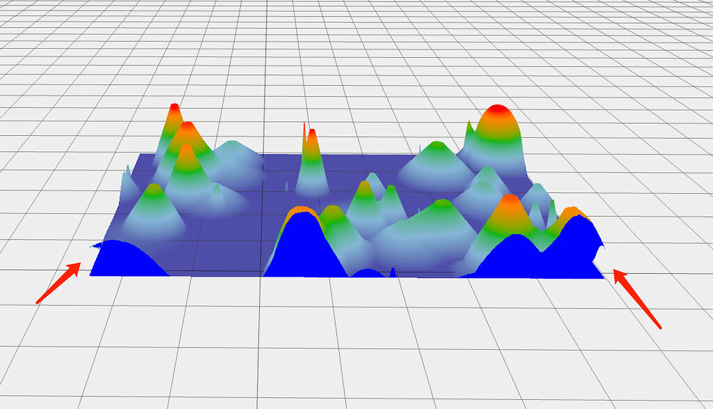


A heatmap condenses thousands of readings into a matrix of colours that the eye decodes almost instantly as gradients and anomalies, while a scatter plot lays every observation bare, inviting the viewer to hunt for correlation, clusters, or surprise. Both formats thrive on volume.
Yesterday’s laptops stalled at a few hundred SVG elements, yet modern handsets now render millions of WebGL vertices without blinking. That leap in capacity arrives precisely when businesses are drowning in telemetry.
Warehouses stream temperature grids, autonomous vehicles emit positional clouds, and e-commerce platforms log every click.
Information that would once have been sampled or coarsely bucketed can finally be explored in full fidelity through responsive JavaScript Charts, promoting an honest dialogue between the people who ask questions and the data that holds the answers.
Choosing the right rendering approach, Canvas 2D, WebGL, or an abstraction that blends the two, therefore shapes not only performance budgets but also the evolutionary path of a product.
The pages that follow examine the twin disciplines of heatmaps and scatter plots from technical, ergonomic, and ethical angles, providing a practical guide for teams intent on turning raw numbers into clear stories.
Developer note from SciChart: When benchmarking canvas-based heatmap renderers, we found that a cell-size-aware texture upload strategy reduces frame-time variance dramatically on mid-range GPUs.
If your workload demands more than 10,000 cells per frame, consider the JavaScript Heatmap Chart which offloads interpolation to WebGL and keeps the UI thread free for pointer events.
The Rise of Data-Dense Visualisations
Long before browsers embraced hardware acceleration, heatmaps were largely relegated to server-side raster generation. They appeared as static PNGs delivered by MATLAB or R scripts, useful but inert.
The advent of GPU-backed WebGL in 2011 and the maturation of the Canvas 2D API transformed that landscape. Suddenly, tile-based games, 3D point clouds, and interactive financial charts could share the same rendering surface.
Business stakeholders noticed that the same technology stack could be repurposed for complex monitoring dashboards, shortening development cycles and reducing total cost of ownership.
Scatter plots underwent a parallel renaissance. In the early 2000s, the typical Java applet was limited to a few thousand SVG elements before stuttering; today, a smartphone GPU can push 150,000 GL_POINTS at 60 fps. That muscle allows designers to retain the raw granularity of underlying observations rather than binning them into histograms too early, preserving statistical power throughout the user journey.
Heatmaps: Seeing Patterns in the Noise
A heatmap encodes three dimensions of information: the horizontal axis, the vertical axis, and the colour of each rectangular cell. At first glance, the mapping appears trivial, yet transitioning from prototype to production raises complex design questions.
Foremost is the provenance of the colour palette. Diverging palettes highlight deviations from an expected midpoint, sequential palettes emphasise magnitude, and cyclic palettes are reserved for angular data such as wind direction. Accessible design demands palette choices that remain legible to users with colour-vision deficiency, often achieved by pairing hue shifts with luminance steps.
Another pitfall is the treatment of missing values. Simply assigning NaN cells the same colour as zero produces misleading stripes when sensor gaps align. Contemporary engines instead allow transparent cells or provide a separate “data absent” swatch.
Interpolated heatmaps, popular in meteorological dashboards, add a further twist: each cell’s colour represents a kernel-smoothed average rather than raw input. GPU shaders excel here, but kernel radius must remain a user-tuneable parameter or local maxima risk being buried.
Scatter Plots: Individual Points, Collective Insights
Scatter plots answer a different question: how do individual events relate across two continuous axes? Rather than density, the focus is on correlation and outliers. Markers should be distinct when zoomed in, yet unobtrusive when zoomed out
Variable shapes and sizes of circles for generic events, squares for categorised cohorts, and triangles for flagged anomalies provide an additional encoding channel without resorting to colour alone.
High-volume scatter plots strain the DOM when each point is an SVG element. Canvas-based renderers sidestep that overhead but lose native hit-testing. A dominant workaround is the “picking buffer”: an off-screen canvas painted with unique colour identifiers.
During interaction, the tool reads a single pixel to map cursor coordinates to a data index. Performance falls to O(1) per event, making interactivity feasible even at a million points.
Choosing the Right Rendering Technology
All paths inevitably confront the trilemma of speed, fidelity, and engineering effort. SVG shines for crisp lines and small datasets with elaborate styling requirements. Canvas 2D offers faster fills and strokes but still leans on the CPU.
WebGL unlocks the GPU but trades away the declarative comfort many front-enders enjoy.
Hybrid libraries attempt to abstract these trade-offs, exposing a consistent API while selecting an optimal backend under the hood.
React developers face an additional layer: reconciliation. Should chart primitives live inside the virtual DOM or stand apart as imperative draw calls? Hooks such as useRef and
useLayoutEffect enable a clean separation: React owns container sizing and high-level state, while the chart engine handles low-level drawing. This pattern prevents unnecessary re-renders and helps large dashboards pass stringent Lighthouse performance budgets.
Performance Considerations at Scale
Heatmap performance hinges on the cost of uploading textures to the GPU. A naïve implementation treats each frame as a fresh image; smarter approaches mutate only sub-regions that change.
Scatter plots hinge on vertex buffers: Preload immutable series into GPU memory and update only those in flight. Depth ordering, if required, can be pre-computed into an index buffer, avoiding expensive sort operations on the JavaScript thread.
Browser garbage collection can be a silent saboteur. Typed arrays, once dropped, must be nulled to prevent lingering closures that delay free cycles. The fastest shader pipeline means little if occasional GC pauses freeze the UI for 200 ms.
Profilers such as Chrome DevTools and Firefox Performance visualise these spikes; the common fixes are array pooling and reusing Float32Arrays.
Interactivity and User Experience
No chart stands alone; users pan, zoom, brush-select, and export. For heatmap, the dominant gesture is box-zoom, typically implemented via mouse drag or pinch.
A refined UX offers elastic edge resistance to prevent overscroll and preserves axis label ticks at sensible intervals. Tooltips in heatmaps can display either the raw cell value or aggregated statistics within a hover window. The choice depends on the domain: in genomics, exact integer counts matter, whereas in retail analytics, an average basket size suffices.
Scatter plots invite lasso selection: free-form polygons drawn by the user to isolate clusters. WebGL implementations may convert screen-space polygons into barycentric coordinates on the GPU or fall back to CPU point-in-polygon tests for smaller datasets.
Differentiated hover styling, halo glows, or enlarged markers should be throttled; pointer-move events fire at 60 Hz and can saturate a poorly debounced handler.
Accessibility and Colour Considerations
Roughly eight per cent of men and one per cent of women experience some form of colour-vision deficiency. Heatmaps and scatter plots reliant solely on hue violate WCAG 2.2 guidelines. Sustainable design pairs colour with pattern overlays or per-cell textual data on focus.
Prefer HCL-based palettes over RGB ramps; the former track human perception more faithfully across luminance shifts. When performance constraints forbid patterned textures, designers can include a supplementary histogram keyed to data category, ensuring shape as well as shade communicates intent.
Server-Side Rendering and Static Exports
While client-side rendering dominates day-to-day dashboards, certain workflows demand deterministic server-side output. Regulatory filings, academic journals, and nightly batch reports need pixel-perfect artefacts generated without human intervention.
Headless Node canvases using OffscreenCanvas offer one route, albeit without GPU acceleration. Alternatives include spawning a WebGL context inside a Puppeteer-controlled Chromium instance or exporting vectorised SVG snapshots that preserve resolution independent of DPI settings.
Extending the Grammar: Derived Metrics and Linked Views
A static heatmap rarely answers the next question: “Why does this region glow red?” Modern UI patterns link multiple charts via shared coordinate systems.
Hovering over a cell can highlight the corresponding row in a parallel-coordinates plot or trigger a drill-down that replaces the heatmap with a detailed scatter of raw observations.
Cross-filtering hinges on a publish-subscribe bus; libraries such as RxJS or Zustand provide lightweight, event-driven glue.
Derived metrics often appear as overlays: contour lines on a heatmap delineate equal-value bands, while polynomial regression curves on a scatter plot summarise trend direction. Compute these overlays on a Web Worker to prevent UI jank, marshalling the result back via transferable objects. Double-buffer the canvas to fade overlays in smoothly.
Statistical Integrity and Data Ethics
Visual density can mislead. Interpolated heatmaps imply smoothness even when underlying probes are sparse, and scatter plots may hide heteroskedasticity when point sizes encode a third variable.
Always expose data provenance: sampling interval, sensor accuracy and the meaning of null cells. In sectors such as healthcare and finance, regulators treat omission by design as misrepresentation. An ethical dashboard surfaces uncertainty explicitly, using confidence bands or translucent blur regions to convey variability.
Benchmarking Case Study: Real-Time Monitoring in Logistics
A European parcel carrier recently migrated its operational dashboard from server-rendered images to a fully interactive front-end. The critical view comprises a heatmap of per-hub parcel throughput layered alongside a scatter plot of individual delivery-vehicle latencies.
Peak traffic at 12:00 UTC involves roughly 450 hubs and 18,000 vehicles updating every five seconds. The previous solution, a tile service emitting PNGs through a reverse proxy, struggled to remain within a two-second SLA.
The engineering team adopted a WebGL-based renderer and batched incoming MQTT streams into typed arrays. Benchmarking showed that each heatmap refresh, including palette recomputation, consumed 4.3 ms on a 2023 MacBook Air; scatter-plot updates took 5.1 ms before index-buffer reuse was added.
The overall frame budget stayed comfortably under the 16.7 ms window needed for 60 fps. The key optimisation was decoupling layout from graphics: CSS Grid handled container sizing while the chart engine rendered into an isolated canvas layer.
Subsequent user surveys reported a 17 per cent reduction in perceived latency and a 22 per cent uptick in successful manual interventions during network incidents.
The takeaway underscores a broader theme across JavaScript Charts: real-time performance is less about raw GPU calls and more about disciplined event aggregation, predictable memory hygiene and an architecture that keeps the main thread calm.
Compliance and Audit Trails
In sectors regulated by bodies such as the FCA or EMA, every visualisation that drives decision-making must be reproducible. Progressive disclosure helps: each interaction generates a hash of the underlying dataset and the UI state, written to an immutable log.
When a supervisor later audits a decision, the dashboard replays the exact combination of filters and zoom levels. Modern JavaScript Charts frameworks now expose serialisation hooks precisely for this purpose, converting camera matrices and palette stops into JSON ready for notarisation.
Future Directions
The emerging WebGPU specification, nearing full browser support, promises further performance gains. Its compute shaders allow data aggregation on the device, enabling density plots to be derived on the fly and composited as textures without leaving GPU memory.
Hybrid heatmap-scatter plots will soon render low-density regions as discrete points while switching to a tone-mapped texture where observations cluster, all within a single draw call.
Machine-learning models compiled into WebAssembly are positioning themselves as first-class citizens of the dashboard. Consider an outlier-detection algorithm running at 30 Hz, feeding back confidence scores that modulate marker opacity in real time.
Such tight feedback loops will redefine expectations around exploratory analytics, placing additional emphasis on deterministic reproducibility and transparent fallback states when a model drifts.
Conclusion
Heatmaps and scatter plots earn their popularity by compressing complex, multivariate relationships into visuals that a user can parse in seconds.
The confluence of hardware-accelerated browsers, mature libraries, and cloud-native deployment means teams no longer compromise between insight and interactivity. Whether they appear within large-scale observability panels or lightweight mobile apps, these two chart types remain indispensable.
Among the sprawling ecosystem of JavaScript Charts, they stand out as workhorses that repay thoughtful engineering with clarity and speed. Their continued evolution, powered by standards that did not exist five years ago, suggests the next generation of data stories will be both richer and faster than anything currently on the screen.
As engineers embrace these possibilities, an unwavering focus on ergonomics, performance budgeting, and ethical clarity will determine which charting strategies stand the test of time and which fade into legacy code.